The Art of Book Cover Design with Alissa Dinallo
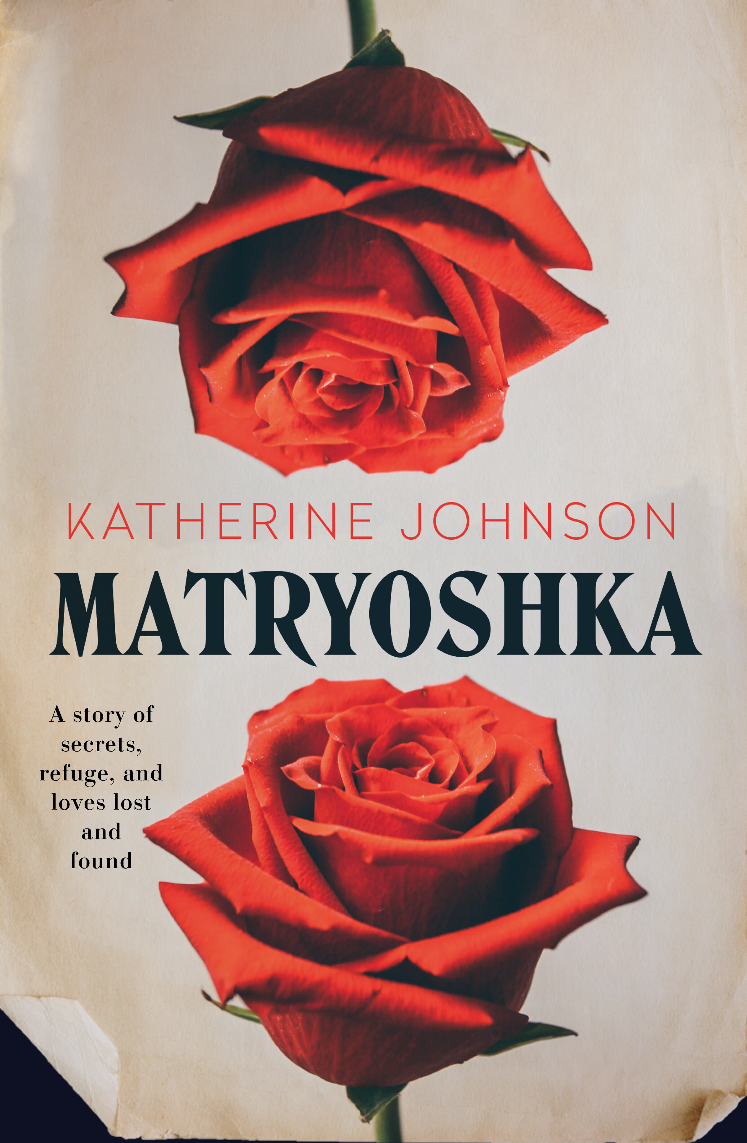
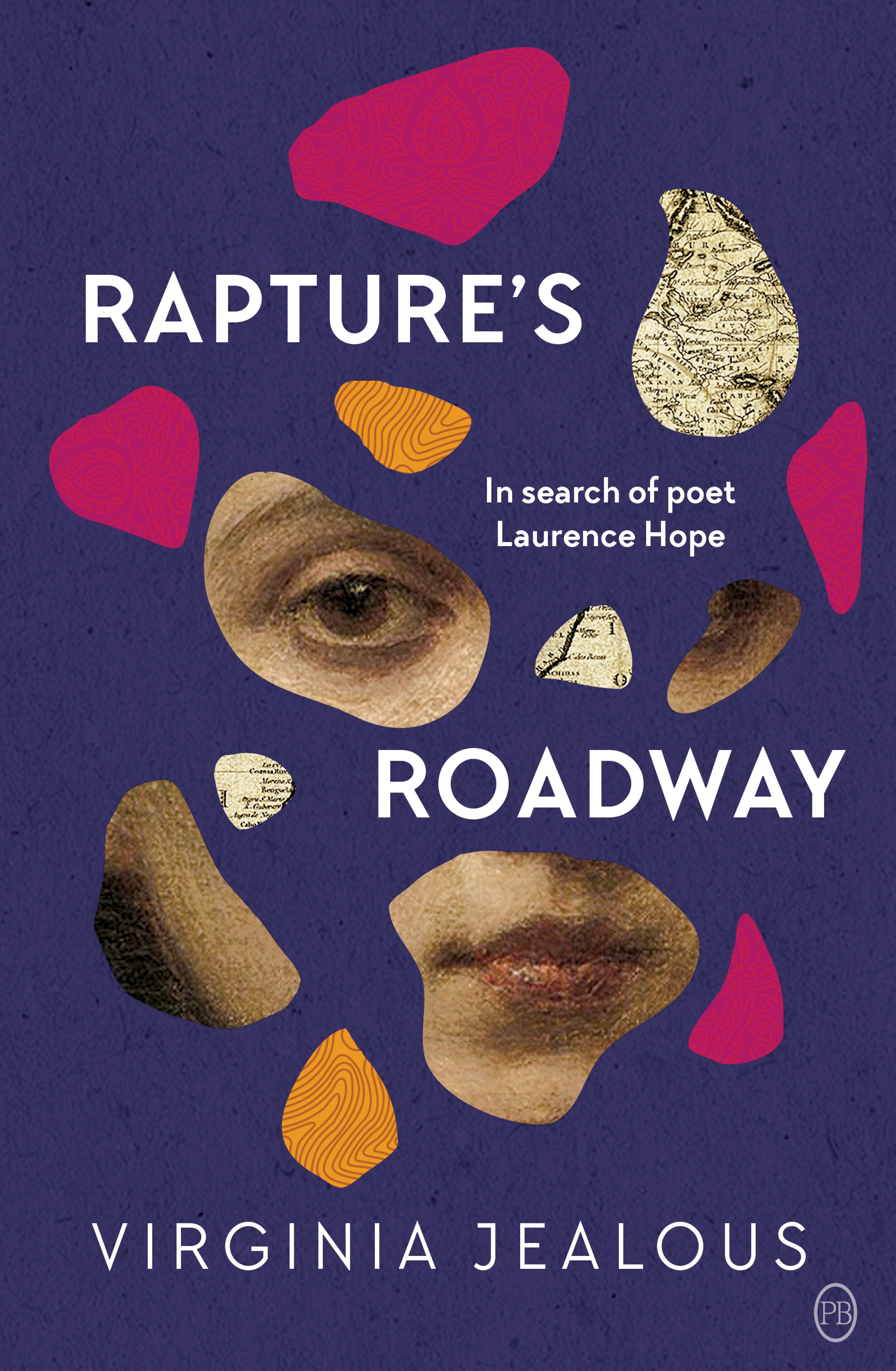
Alissa Dinallo’s designs grace the covers of many Ventura books - from the more complex Paris Savages, Matryoshka and Raptures Roadway to the minimalist cover of The Warming. We chatted to Alissa about the origins of her design career, the evolution of a book cover, and where her inspiration comes from.
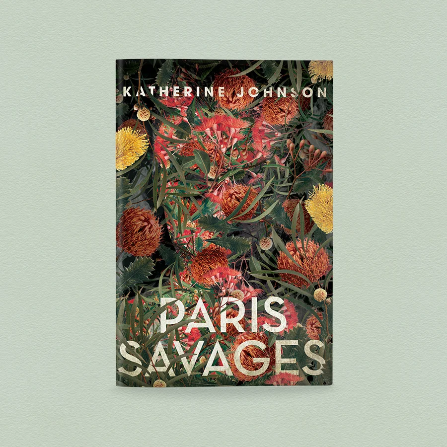
Alissa Dinallo’s designs grace the covers of many Ventura books - from the more complex Paris Savages, Matryoshka and Raptures Roadway to the minimalist cover of The Warming. To celebrate the release of Paris Savages, we chatted to Alissa about the origins of her design career, the evolution of a book cover, and where her inspiration comes from.
Tell us a little about yourself – how did you get into book design, and what do you love about it?
While I was at university (UTS) I met a brilliant tutor by the name of Zoe Sadokierski, who was a former book designer from Allen and Unwin. She really opened my eyes to the possibilities of book design as a career. As I was completing my degree, I managed to get a job at Allen and Unwin archiving books. Once I was in-house working I got to understand how the design process worked and eventually applied for the role of junior designer. After 3 years at Allen and Unwin I moved to Penguin Random House. At the end of 2015 I decided to start my own business as design freelance for all publishers in Australia and worldwide.
When you received the initial cover brief for Paris Savages, what was your process of coming up with the resulting concepts? Talk us through your process.
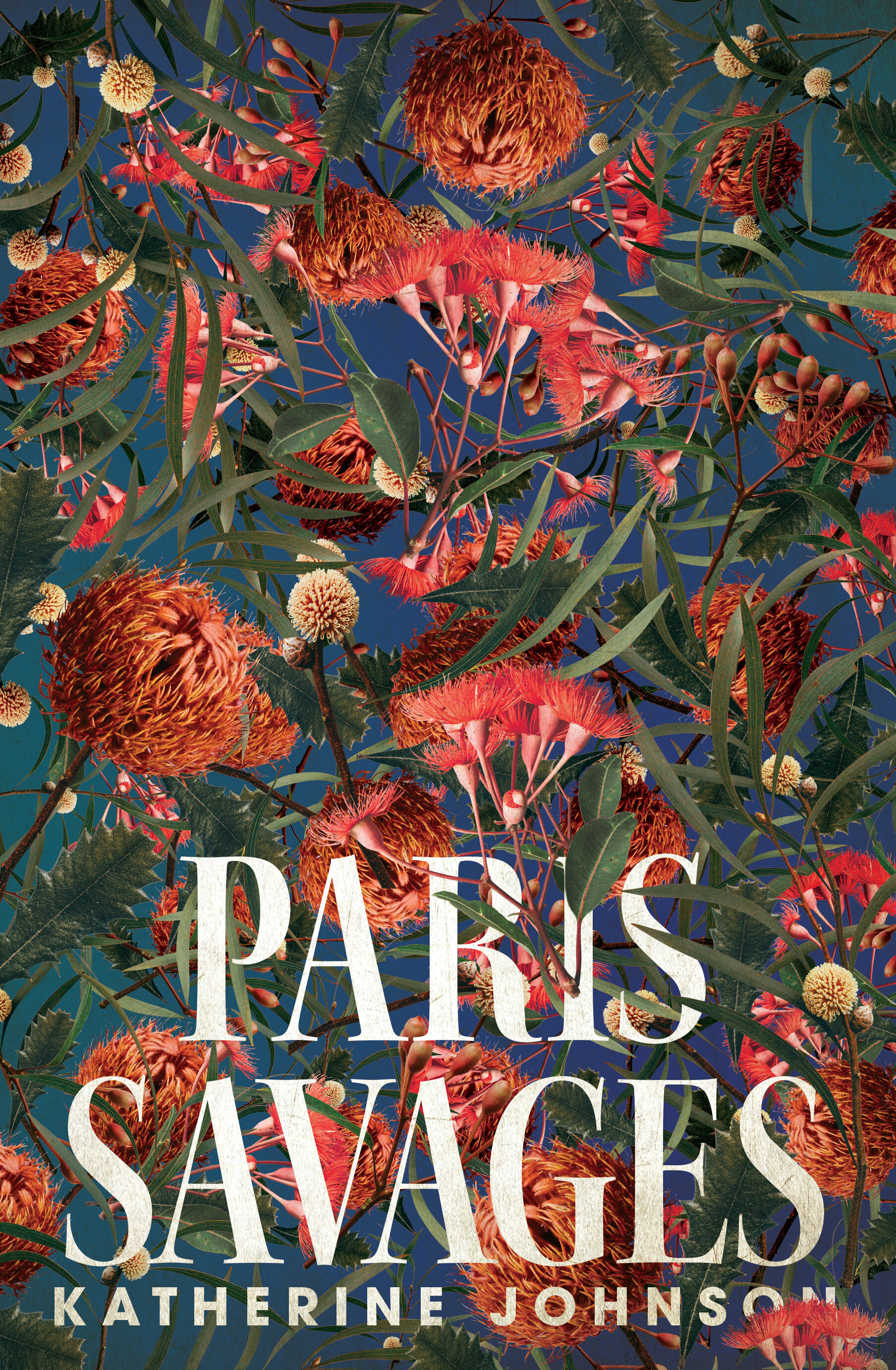
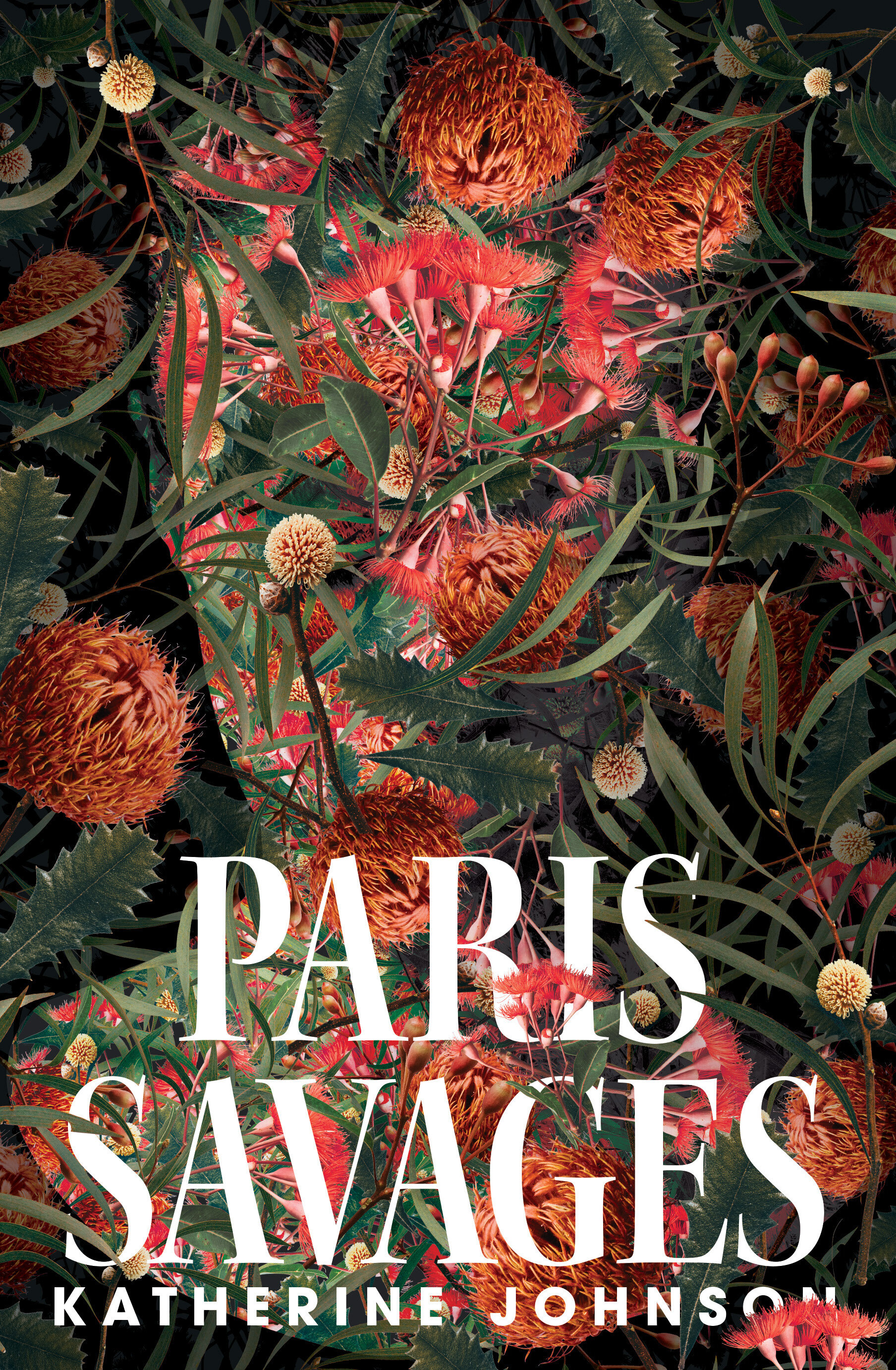
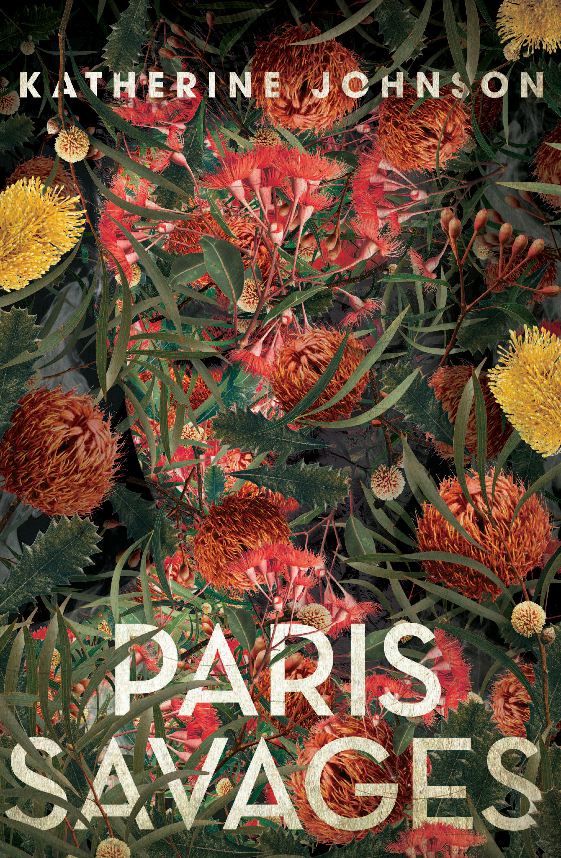
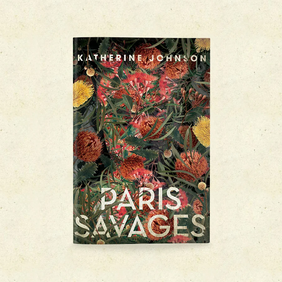
This is the third of Katherine’s books I’ve designed. I love her writing, and have a good understanding of the mood and tone she conveys in novels. I wanted to create something dark, naturally beautiful and subtly Australian. I knew I wanted to use flora in an eye catching, clever way. I was originally inspired by the beautiful Ernst Haeckel illustrations, which have a great sense of dark, yet beautiful mystery. As I worked on these concepts, Ventura felt we needed a human element, so I focused on creating covers that hinted at a female character. I tried overlaying illustrations of Australian flora onto a woman’s skin/face. Whilst working through these concepts I started collaging a woman’s face with leaves and flowers. And that’s how I eventually arrived at the final cover.
some early concepts of Paris Savages
How long does it usually take you to come up with concepts once receiving a cover brief from the publisher? Do you have a number of concepts you aim for?
Depending on the urgency of the cover, it generally takes me around 3 weeks. This gives me time to read the manuscript properly and come up with key imagery I think best illustrates the text, whilst keeping it commercial/appropriate to the books genre. I don’t aim for a certain number of roughs, but once I’m on a roll I can produce a lot, and I generally need to cull them before sending them off.
Where do you draw your inspiration from as a designer?
I’m always looking at how image and text interact in the world. I’m always taking note/photos of cool shop signs, menus, movie posters, artworks, logos, vintage books, and other graphic design (the list is honestly endless). Social media platforms like Instagram and Pinterest also allow me to catalogue inspiring visuals so I can look back at them when I receive new briefs.
What is the aim of any cover you design?
There are a lot of things you want to achieve when designing a cover – from good design to a product that sells. But I think the most important aim for me is to honour the work of the author, and give their hard work a brilliant face for the world.
Do you have any other memorable Ventura covers you’ve worked on?
I have to say, Paris Savages is one of my all time favourite covers with Ventura. I also loved working on Katherine’s previous books (The Better Son and Matryoshka). More recently I loved working on The Warming and Rapture’s Roadway.
The Rise of #Bookstagram
The trend for curated visuals has given rise to #booksofinstagram, which links Instagram users to a world of stylish books and equally stylish readers. This hashtag is not exclusive, but it is only really effective for books with high design values—they often feature elaborate flat-lays that relay some of the narrative or add to the hygge feeling of curling up with a book. So what has given rise to the #bookstagram?
With 5000 new titles a month released into the Australian market, what publishers seek is cut-through: the ability to stand out from the crowd.
Cut-through can be achieved by many methods but the sweet spot, which is available to all publishers, is the cover. Books that are the same size, the same price and the same specs all have one obvious variable from the outside: the cover.
Like the LP record covers of my youth, a book cover is consumable art that appeals to our sense of aesthetics. The cover of a book positions it in the marketplace; it relays a message about the content and is a call-out to a loyal readership. I am always amused by the publishing maxim ‘Know thy shelf ’—a directive to visit bookshops and observe how different books are displayed—and this is particularly useful when thinking about cover design.
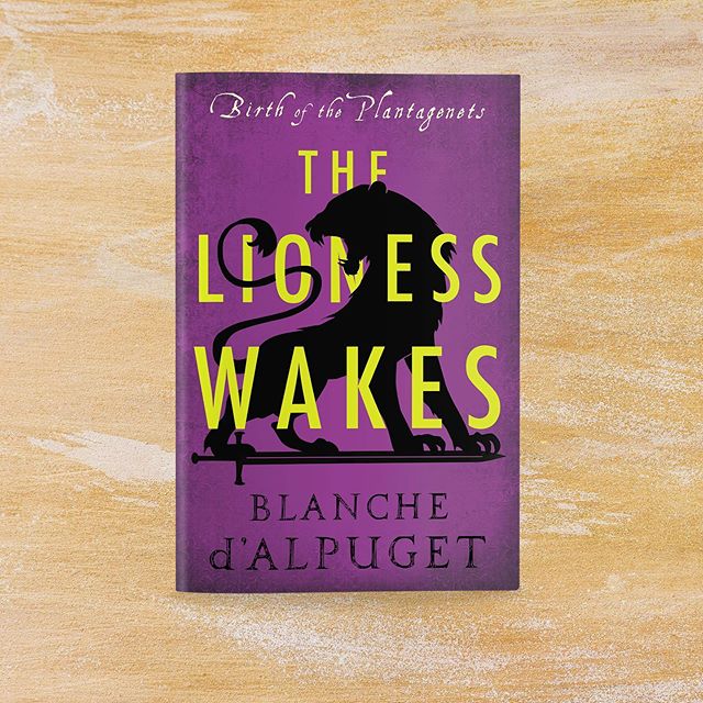
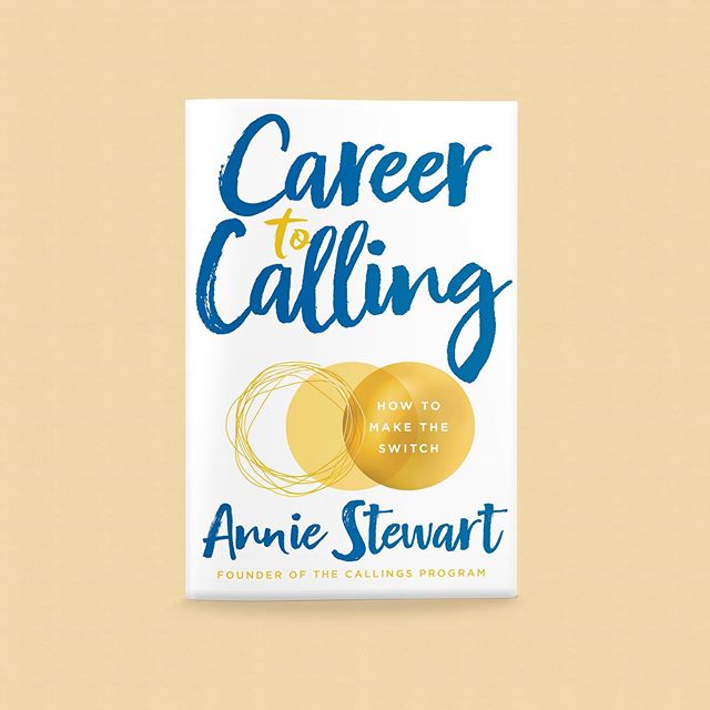
The first role of design is to define the genre. In fiction the big divide is between commercial and literary fiction, and this influences everything from the book’s title to the final typography. There are accepted norms for each genre that are obvious to anyone browsing in a bookshop: thrillers have the author’s name in BIG CAPITALS; crime covers are bold, black and red; motivation books are often white with strong typography; and biographies feature a full-bleed headshot and a title based on wordplay (Shane Warne’s No Spin being a prime example). But ‘knowing thy shelf ’ makes commercial sense too: it is a hedge against getting lost in the vast market. You want the bookseller and the reader to recognise the genre immediately and know they will enjoy the book.
Despite this herd mentality, the best cover designs often don’t follow a trend, and many stand-out examples of this come from the small literary publishers. Giramondo’s spare minimalist covers are worthy of framing; Xoum and Transit Lounge also punch above their weight. Their covers convey the message: ‘I am intellectual and don’t play by the commercial rules. I am special like you.’
Ventura’s most recent ‘instagrammable’ cover: Paris Savages, by Katherine Johnson
At Ventura, before we even start on cover design we hold a positioning meeting where we decide the readership profile for this book—is it literary, commercial or genre? What are the key elements of the manuscript and why do we love this book? We complete a competitive market analysis and produce a mood board of competing titles. We observe the trends, the imagery and typography, as well as the use of cover quotes, shout lines and subtitles. We want our book to reflect its genre, which offers assurance to both retailer and reader, but also to be unique.
The biggest influence on design trends this decade has been the advent of Instagram and the notion of a curated feed. This concept was introduced to me by the wonderful Ventura author Melanie Dimmitt (Special, September 2019). Melanie comes from a digital background with Collective Hub, HuffPost and Mamamia. She arrived at Ventura with her own mood board, a colour palette for the book and social media promotions. It was a complete visual marketing package for the digital age, and I was very impressed.
This trend for curated visuals has given rise to #booksofinstagram, which links Instagram users to a world of stylish books and equally stylish readers. This hashtag is not exclusive, but it is only really effective for books with high design values—they often feature elaborate flat-lays that relay some of the narrative or add to the hygge feeling of curling up with a book.
We ventured into this world when our marketing coordinator Sophie Hodge joined us last year straight from university. Like her peers, digital is in Sophie’s DNA and she has crafted our Instagram feed to great effect. Our covers are very ‘Instagrammable’ as a result. But there is more than sheer aesthetics to this. We have found a small army of Instagram reviewers who ply their craft outside the legacy media, and we have a younger and more active readership as a result.
The rise of Bookstagram also offers an opportunity to extend our franchises through visual merchandising. Even bricks-and- mortar bookshops sometimes seem to sell more non-book paraphernalia than books. We in the book world have traditionally been reluctant to venture into designed objects beyond book covers, but when we do break out it has great impact. I will never forget the sight of the stunning Holly Ringland tote bags at the London Book Fair in 2017—it was a delight to see rich Australian botanicals livening up the dull surrounds of Olympia. Maybe more should follow.
An investment in good design leads to a stronger, more vibrant and diverse book market. We should rejoice in the stunning covers that appear on the bookshop shelves and in our feeds. This way we can find new markets and a new generation of readers.
This article was written by Ventura’s Director & Publisher, Jane Curry.
Originally published in Books + Publishing.
You can find Ventura’s instagram here: @venturapress__


